Visual Tension: The Invisible Force Powering Dynamic Design
While balance provides stability, visual tension is the electric force that brings a design to life. It is the art of intentional friction, using color, shape, and composition to provoke a psychological response

In the realm of graphic design, if balance provides a sense of security and stability, then visual tension is the electric current that brings a composition to life. It is the intentional use of "friction" to stir the viewer's psychology, command attention, and prevent a design from becoming static or forgettable.
Mastering visual tension is about understanding the delicate equilibrium between order and chaos.
What is Visual Tension?
Visual tension is a psychological sensation of "unrest" or "pull" created by the arrangement of elements within a frame. It occurs when the human brain—which naturally seeks patterns and closure—encounters an element that defies expected stability. While balance is primarily concerned with the distribution of visual weight, tension permeates every facet of design: color, texture, motion, and form.
The Mechanics of Creating Tension
Visual tension isn't accidental; it is a calculated disruption of harmony. Here is how it manifests across different design dimensions:
Composition
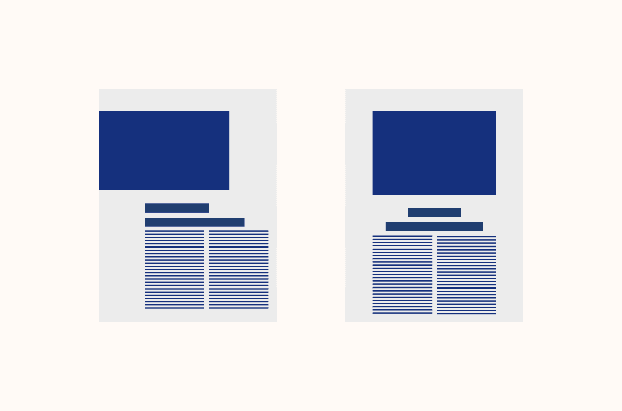
Symmetrical layouts are inherently low-tension; they feel "rested." In contrast, asymmetrical compositions create high tension by forcing the eye to do more work to find equilibrium.
Edge Tension: Placing an object near the very edge of a canvas creates a feeling that it might "fall off," creating an immediate sense of urgency.
Negative Space: Large areas of "white space" can compress or push against subjects, creating a vacuum that heightens the importance of the focal point.
Shape
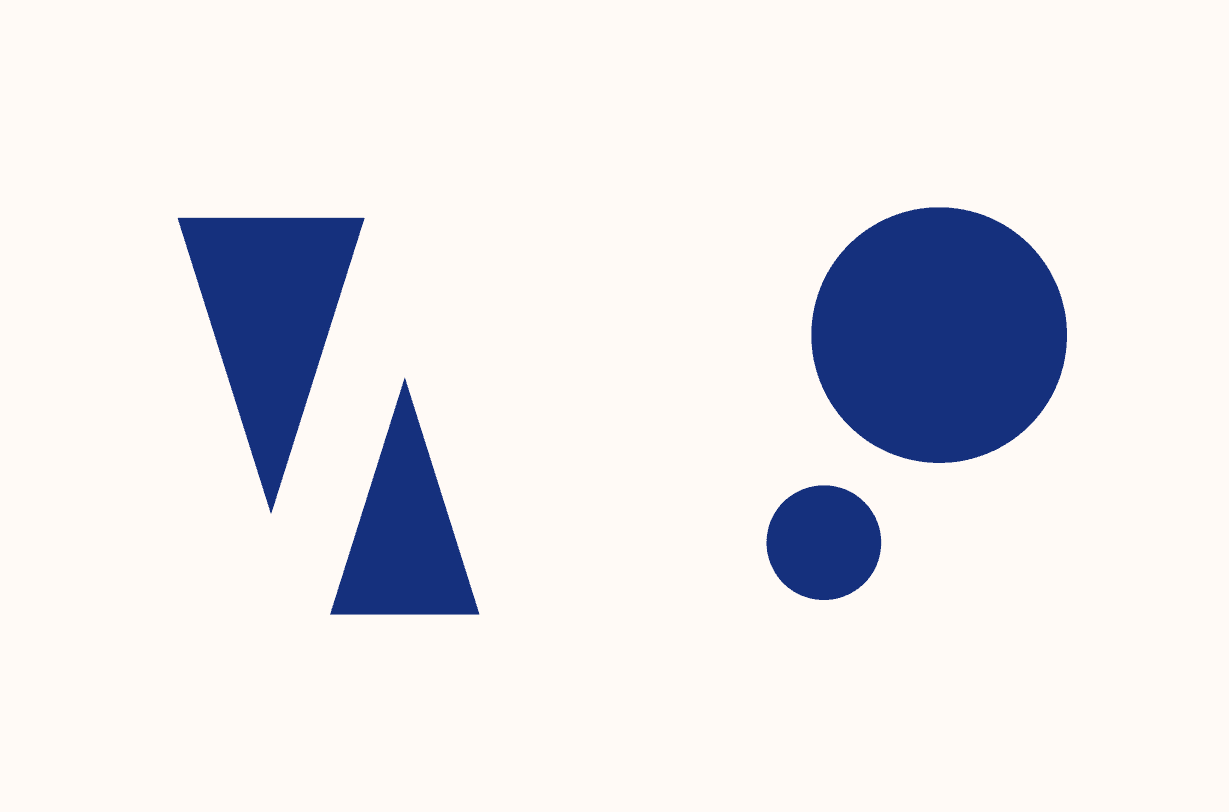
Every shape carries a specific energy.
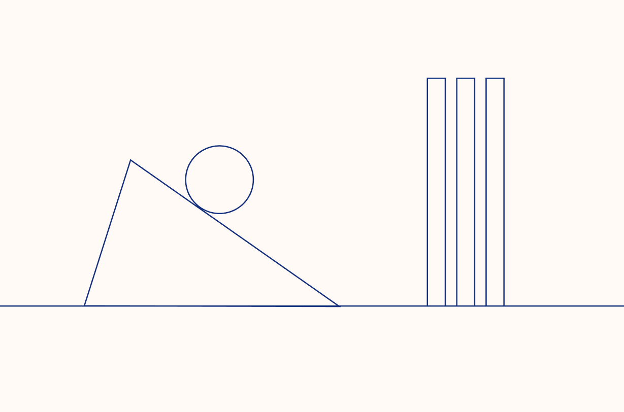
The Aggression of Angles: Circles and soft curves are passive and soothing. Triangles and jagged edges, however, point and "pierce" through space.
Directional Force: Diagonal lines are inherently more tense than horizontal or vertical ones because they imply movement or a struggle against gravity.
Color and Contrast
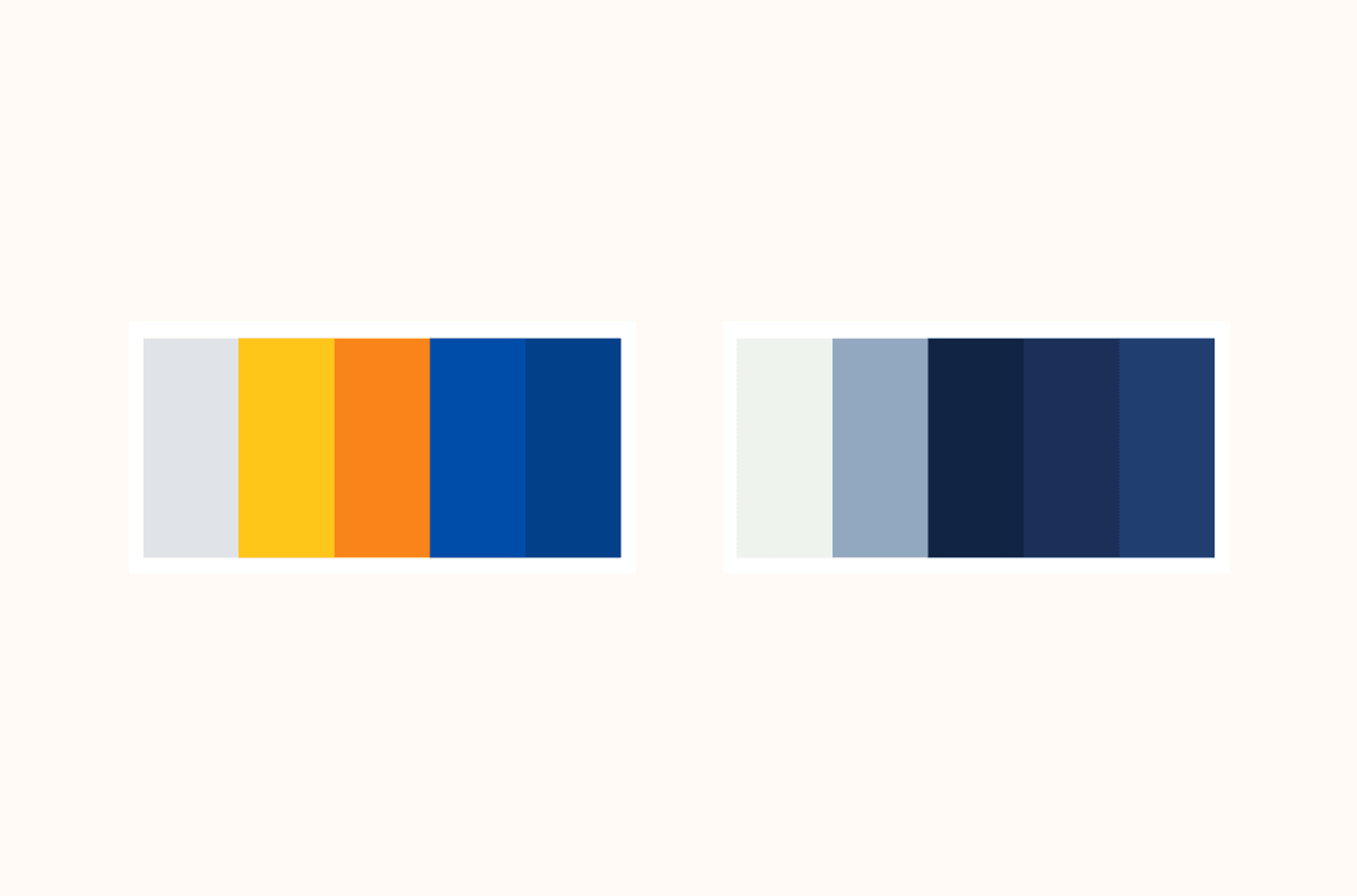
Color creates tension through "vibration."
Complementary Colors: Placing opposites on the color wheel (like orange and blue) creates a high-energy boundary where the colors seem to "clash."
Saturation Disparity: A single, highly saturated element amidst a sea of muted, desaturated tones creates a "visual pop" that demands immediate processing.
Texture
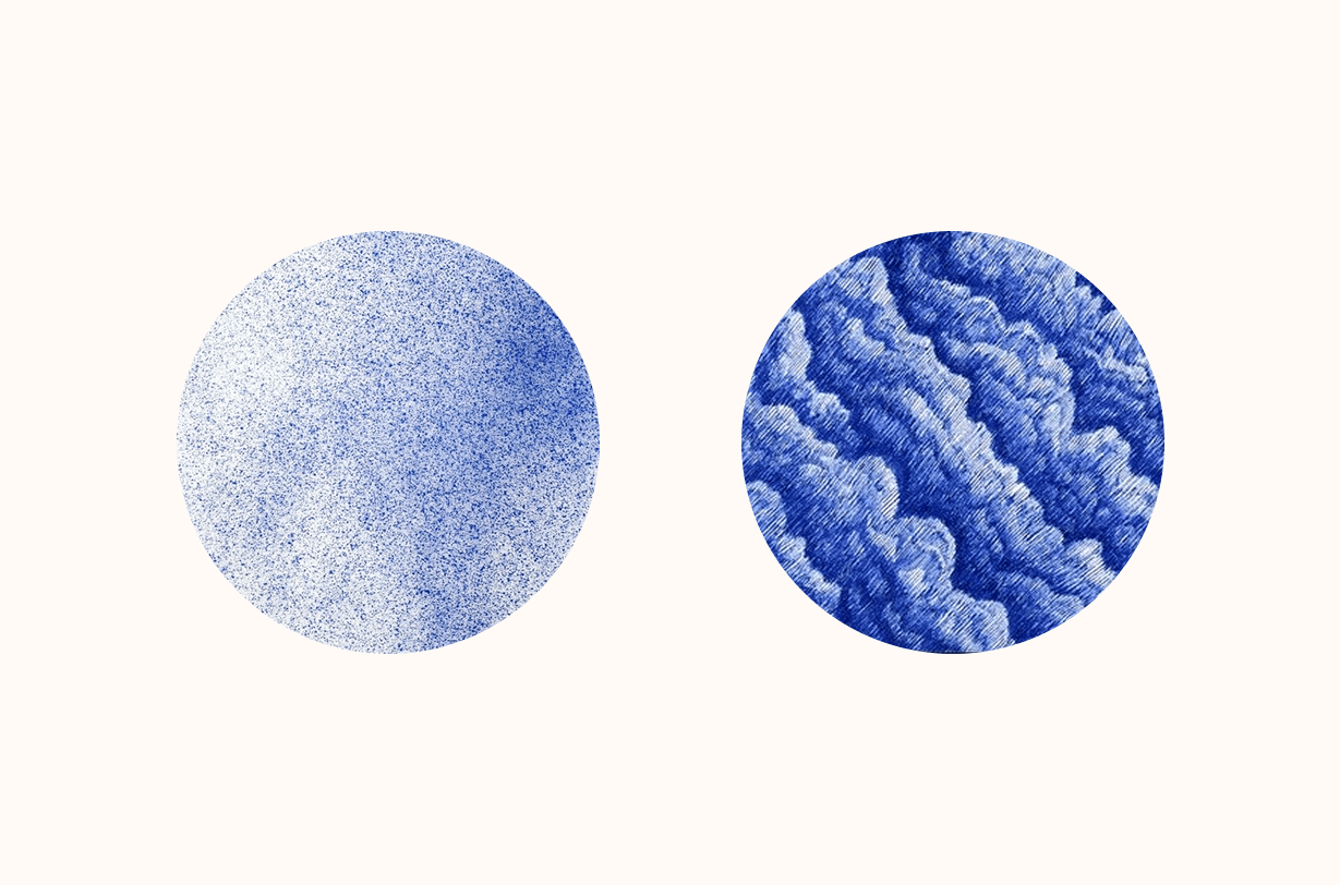
Tension can also be tactile.
Complexity vs. Simplicity: A dense, intricate texture placed against a smooth, flat surface creates a point of friction.
Broken Patterns: If a repetitive rhythm is established and then suddenly interrupted—such as one tilted square in a row of straight ones—it creates a "glitch" in the viewer's expectation, sparking curiosity.
The Vital Role of Tension in Design
Why introduce "stress" into a visual? The purpose is functional, not just aesthetic:
Establishing Visual Hierarchy: Tension acts as a spotlight. Elements with the highest tension naturally become the first thing a viewer sees, allowing the designer to lead the eye through a narrative.
Injecting Motion: In static media, tension is the only way to simulate energy. It represents a "compressed spring" or a "falling stone," giving the design a sense of "before" and "after."
Evoking Emotion: High tension can communicate excitement, danger, or modern edge, while controlled tension can feel sophisticated and intellectual.
Like any powerful tool, visual tension must be handled with precision.
Too Little Tension: The design becomes "dead." It may be balanced and "correct," but it lacks the magnetism to stop a scrolling user or a passerby.
Too Much Tension: If every element is fighting for dominance, the result is visual noise. The viewer becomes overwhelmed, and the message is lost in the clutter.
Conclusion
Visual tension is the difference between a design that is merely seen and one that is felt. It is the art of "calculated instability." By strategically utilizing sharp angles, contrasting colors, and asymmetrical weight, a designer can transform a flat image into a living experience that resonates with the viewer’s subconscious.
In the end, great design isn't just about making things look "nice"—it's about knowing exactly when to pull the string to keep the viewer hooked.